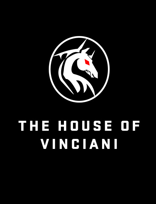
In the House of Vinciani, the Vinciani Standard word mark is the purest form of the brand. The typography without the Emblem, without the V-Mark, and without the Forward Sigil, is the plain spoken standard of the House.
Just the name V I N C I A N I
Why the Standard Exists
Where the Horse Emblem, the V-Mark and the Forward Sigil speak in its three-core identity of the brand, the Standard speaks in language directly.
It speaks the identity of the House, and it says this is Vinciani.
The Standard exists to prove one thing:
The word mark carries weight on its own.
Why the Font is powerful
Typography in branding is often underestimated, but what makes it powerful is the right letterform, the correct spacing, and the proportion measurement that creates brand authority.
The licensed font of the Vinciani Standard speaks with a clean structure and powerful visual of its direct design confidence and it’s DNA mark.
The Font is powerful because it carries weight in three ways:
Clarity: It tells you the name of the House of Vinciani, without distraction you know exactly what it stands for.
Discipline: The word mark has strict spacing, it changes how the brain reads it, and how the brand feels. The increased letter spacing creates breathing room, the wide spacing becomes composed with discipline.
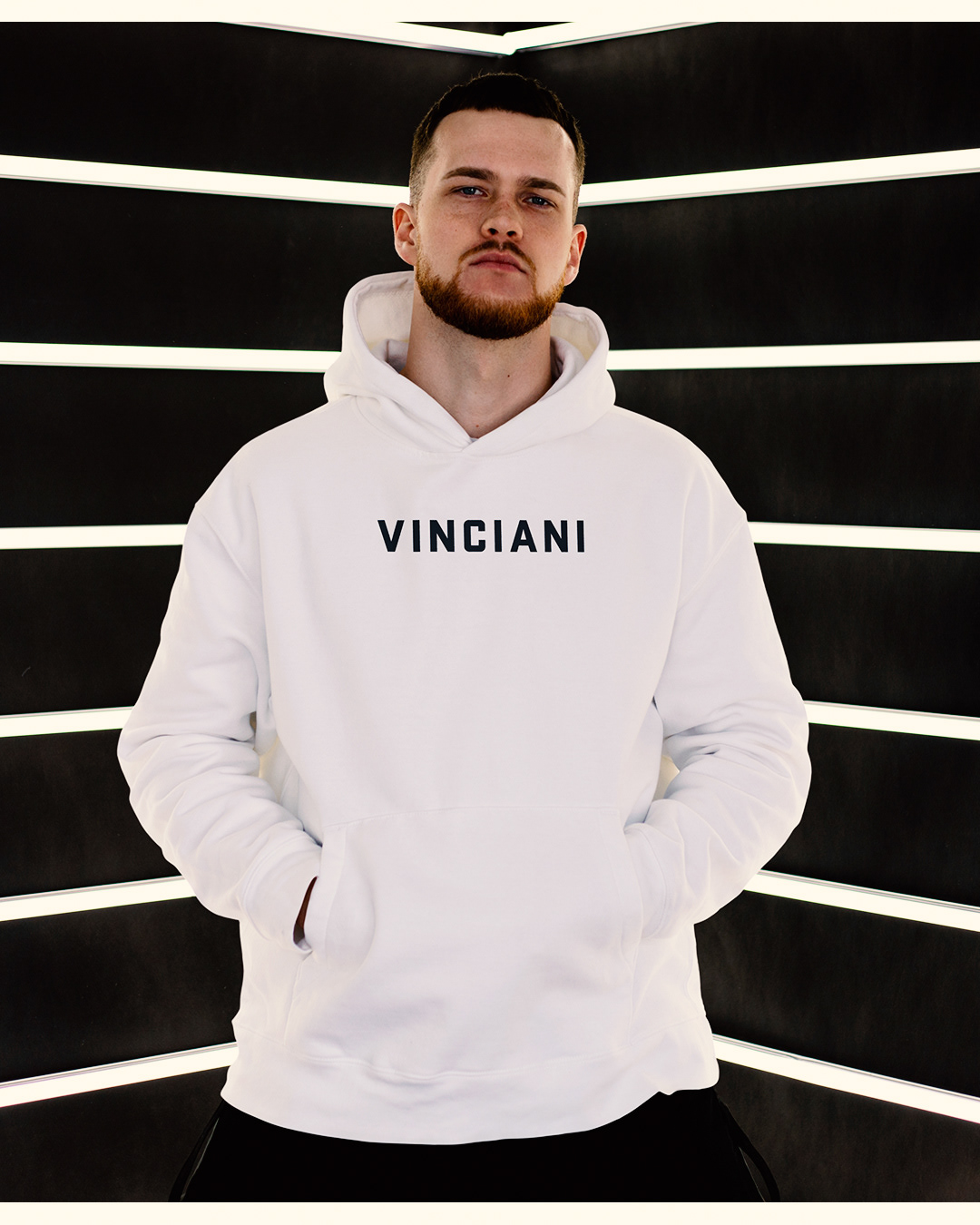
Confidence: A straight word mark on a Vinciani red, black and white hoodie says ‘We don’t need noise, the Standard word mark speaks for itself’.
What the Vinciani Standard Represents
When the Standard stands alone, it represents:
The Door to the House - For someone who has never heard of the Angel of Vinciani, the Emblem, the V-Mark or the Sigil, the word mark on its own is an entity that welcomes those who earn it.
The Minimum Standard - If the word mark of Vinciani is on the garment, then it has passed through the same discipline like every other mark.
It’s a reminder that the House of Vinciani is built on a name with a meaning, an identity of its entire House that is built on Strength, Discipline and Design.
Where the Standard Lives Alone
The Vinciani Standard is strongest on core hoodies, tees, caps, duffle bags and accessories, especially in the Code Red, Code White and Code Black. These are the “day one” pieces of Vinciani, the cleanest entry into the House.
When alone, the Standard is kept centred and bold across the chest, cleanly printed, and in the strongest contrast so that the word is unmistakable.
The official website of Vinciani
www.vinciani.com
The House of Vinciani - Official archive and design journal
Vinciani® is a proprietary brand created by Manny Vinciani and operates under Five Essence Ltd, London, United Kingdom.
All Vinciani logos, symbols, artworks, and visual identities are original creations and protected intellectual property.
Unauthorized use, reproduction, or distribution is prohibited.
Creative direction and original artwork by Manny Vinciani.
www.vibeinkstudios.com